CASE STUDY – Habic
Habic + RAZ Solutions
BIM Content Management System for the cluster of furniture manufacturers
Context
Goals & Metrics
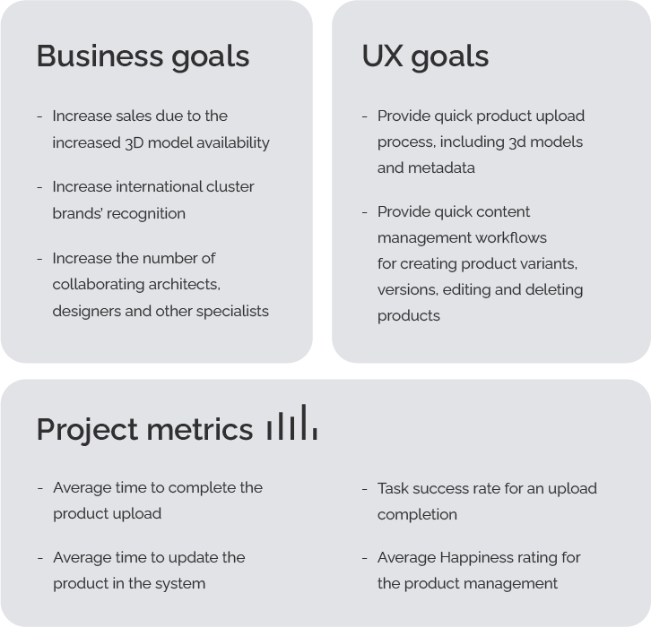
Goals in this project were divided into two categories. Business goals relate to the overall functioning of the cluster. UX goals represent expectations of particular manufacturers towards the developed solution.
Design process
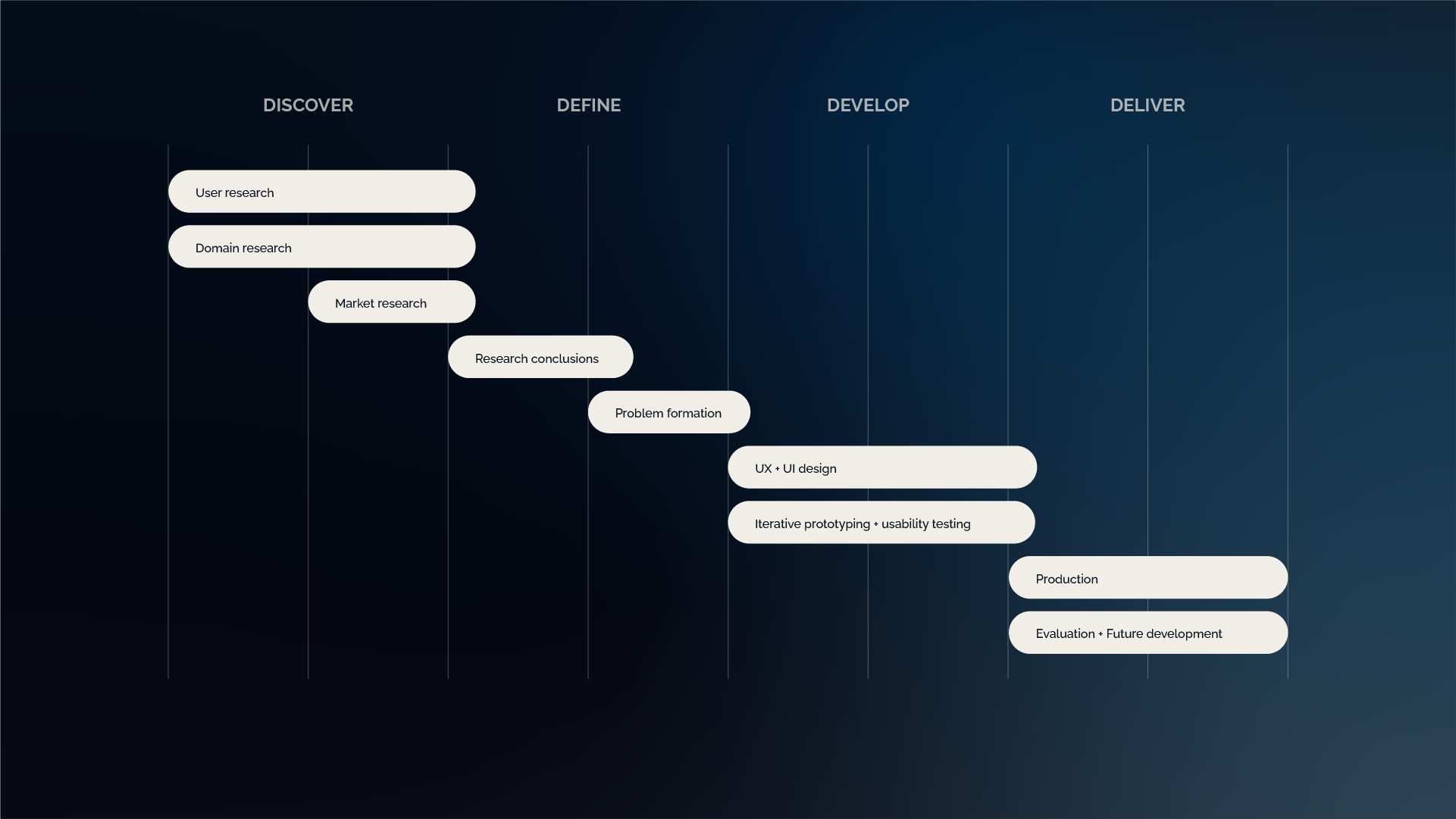
Initially the design process was designed according to the Double Diamond model. Before diving into generating solutions we needed a deepened insight of the potential platform users and required functionality.
Understanding
the users
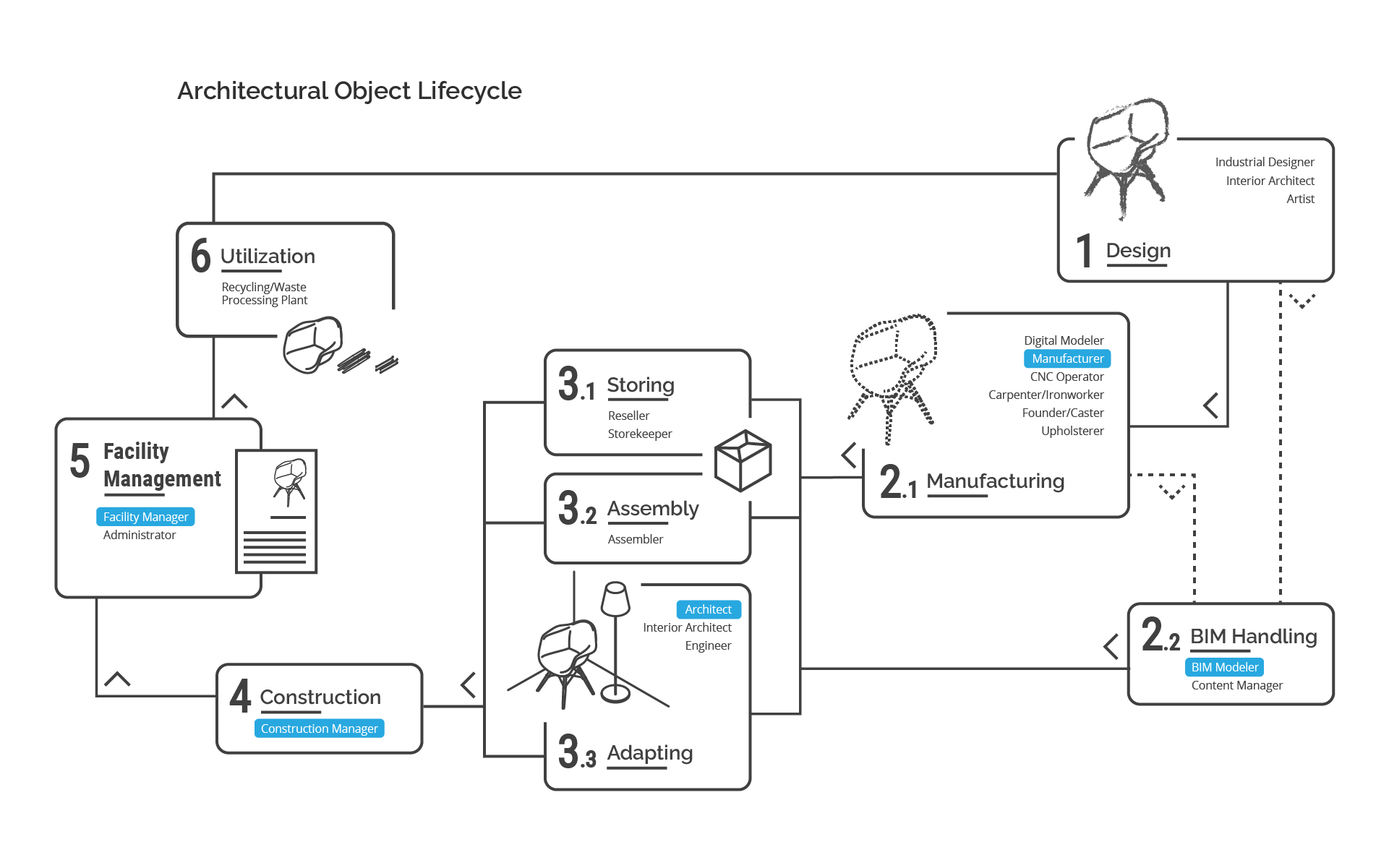
Since the product was intended to connect the manufacturers with other specialists I began my work with the analysis of an architectural object lifecycle. This allowed me to identify the key project stakeholders and their struggles in implementing BIM in their everyday practice. The below diagram presents a synthesis of the architectural object lifecycle and lists people involved at each stage. The highlighted positions indicate potential stakeholders of the product presented in this study.
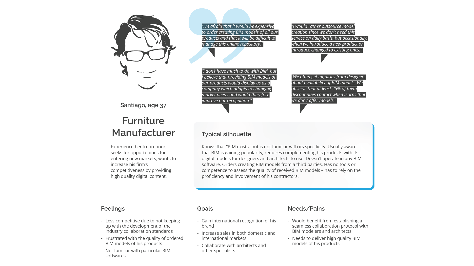
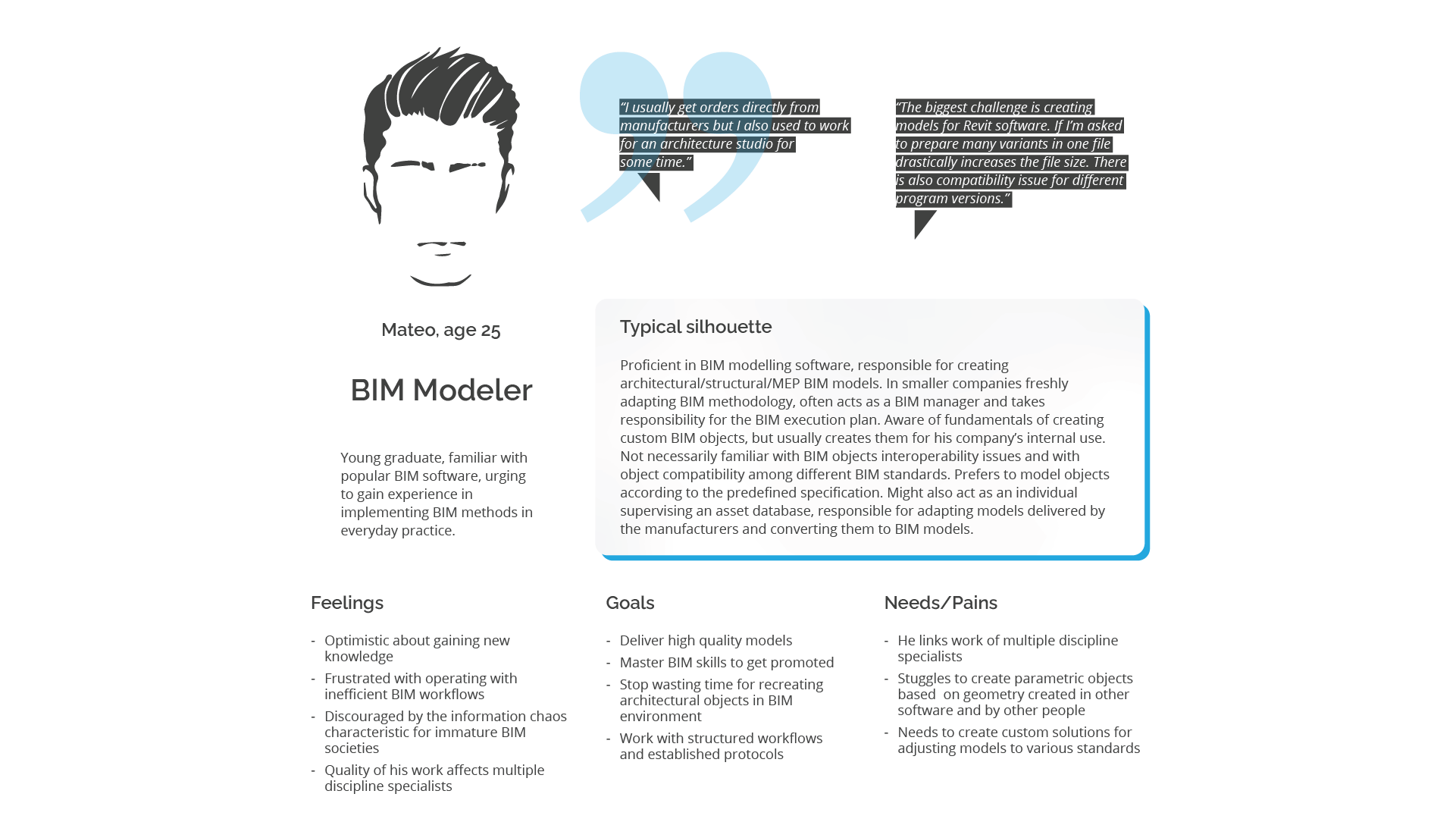
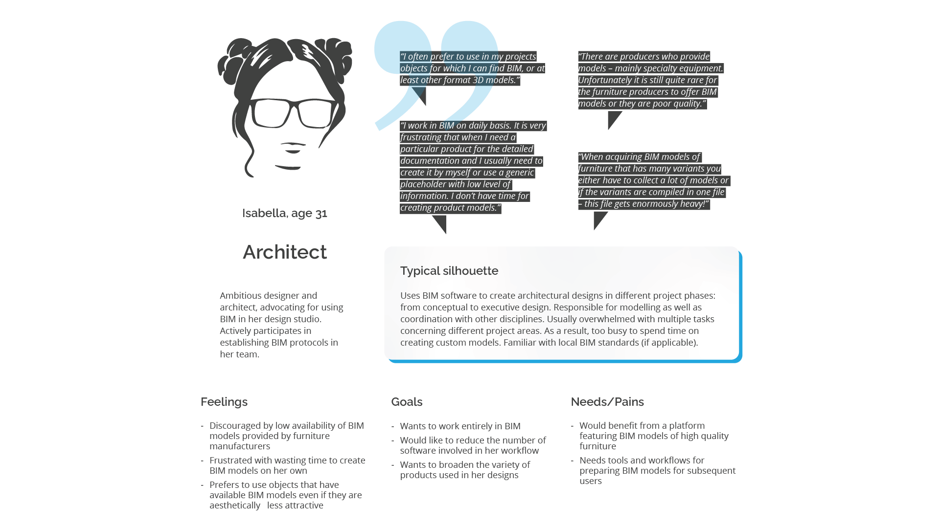
User personas
From the above analysis I identified primary and secondary users of the designed product. To understand their needs I performed IDIs with representatives of each group. Luckily, as an architect I had access to specialists of each group and could approach them directly. On the basis of gathered data I built the following personas:
Understanding
the problem
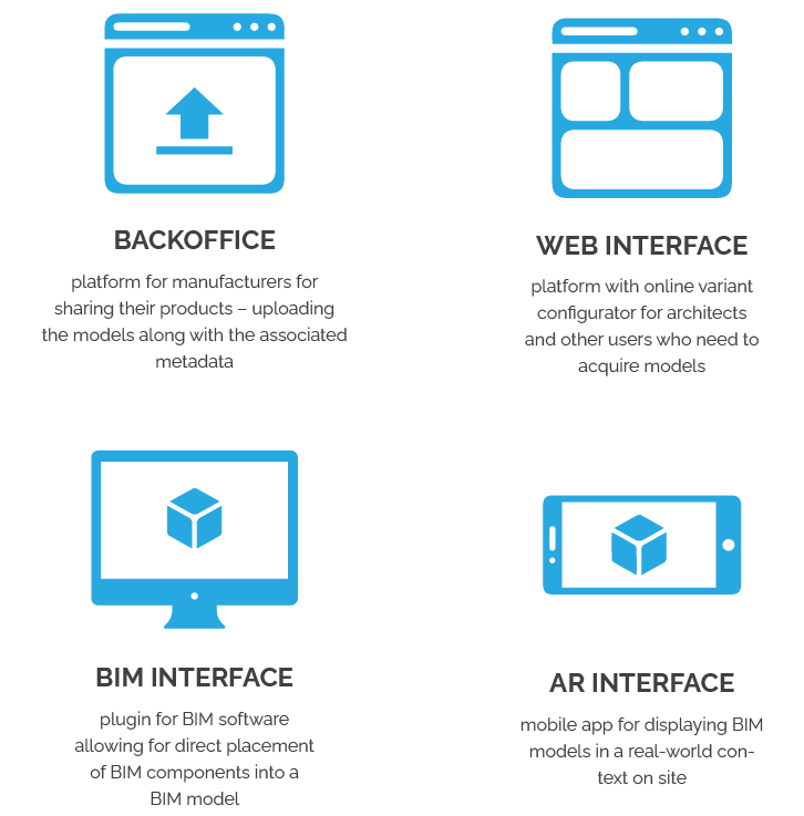
Based on the user needs analysis we determined that the designed platform requires 4 system elements: a central server database and four interfaces that connect particular stakeholders:
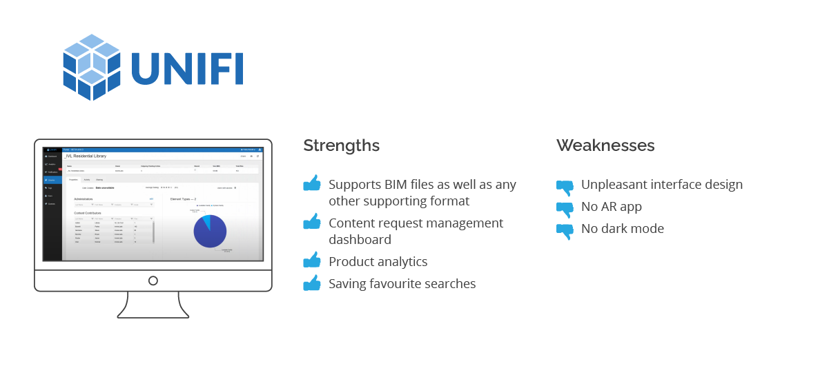
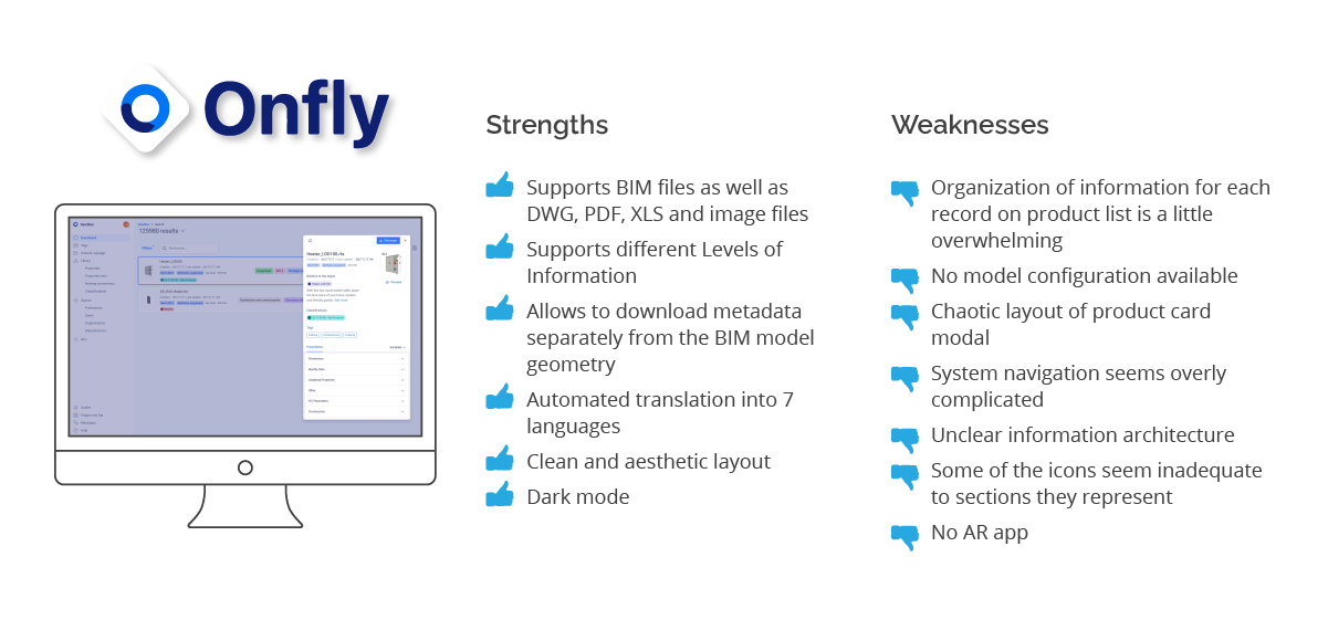
Market research
Knowing the direction our team was heading and before diving into platform development I researched content management systems for manufacturers available on the market. I analysed 3 top products and divided my findings into strengths and weaknesses.
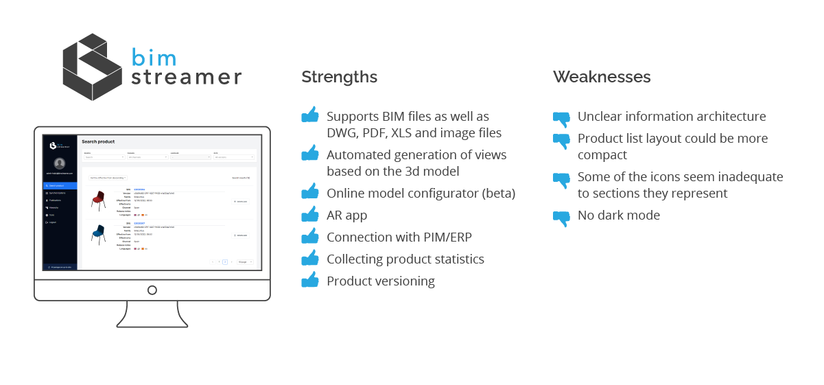
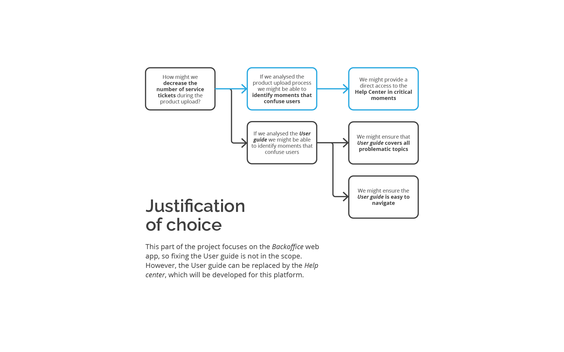
Given that in this project I was involved mainly in the Backoffice platform design and development, the rest of this case study will focus on this aspect of the designed product.
Turning point
After market analysis together with the client we concluded that instead of developing a new platform it would be better to adapt an existing commercial solution. We initiated talks with one of the companies which offered functionalities closest to the client’s requirements and the client decided for collaboration.
However, after first experiences with the product demo version we quickly noticed that there is much to improve in this system.
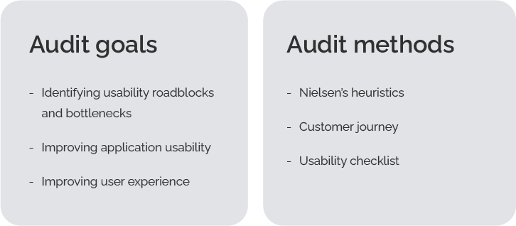
UX audit
In agreement with the solution provider I performed a UX audit to identify and prioritize existing problems with the product. Below I present an extract of the most urging issues.
Critical issue
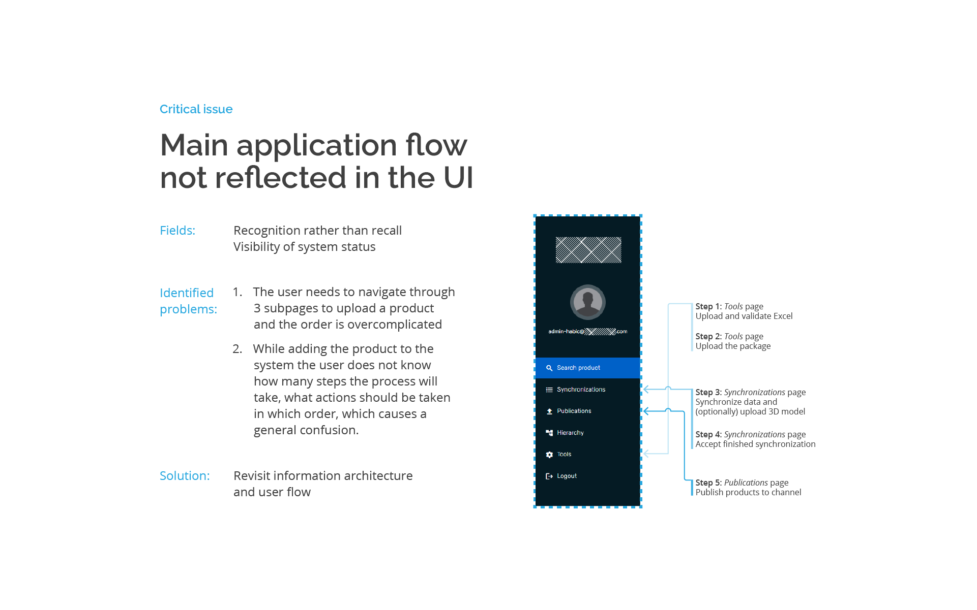
Information architecture
The application’s information architecture doesn’t correspond with design patterns recognized in other content management systems.
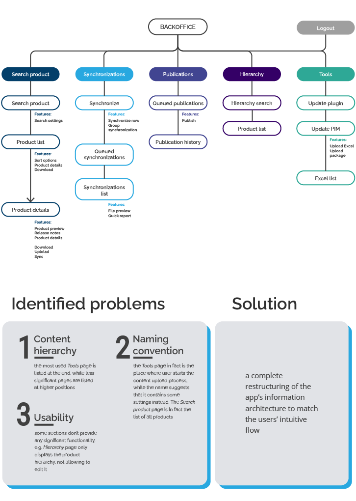
Critical issue
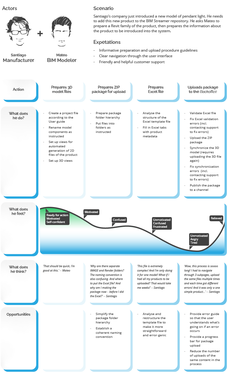
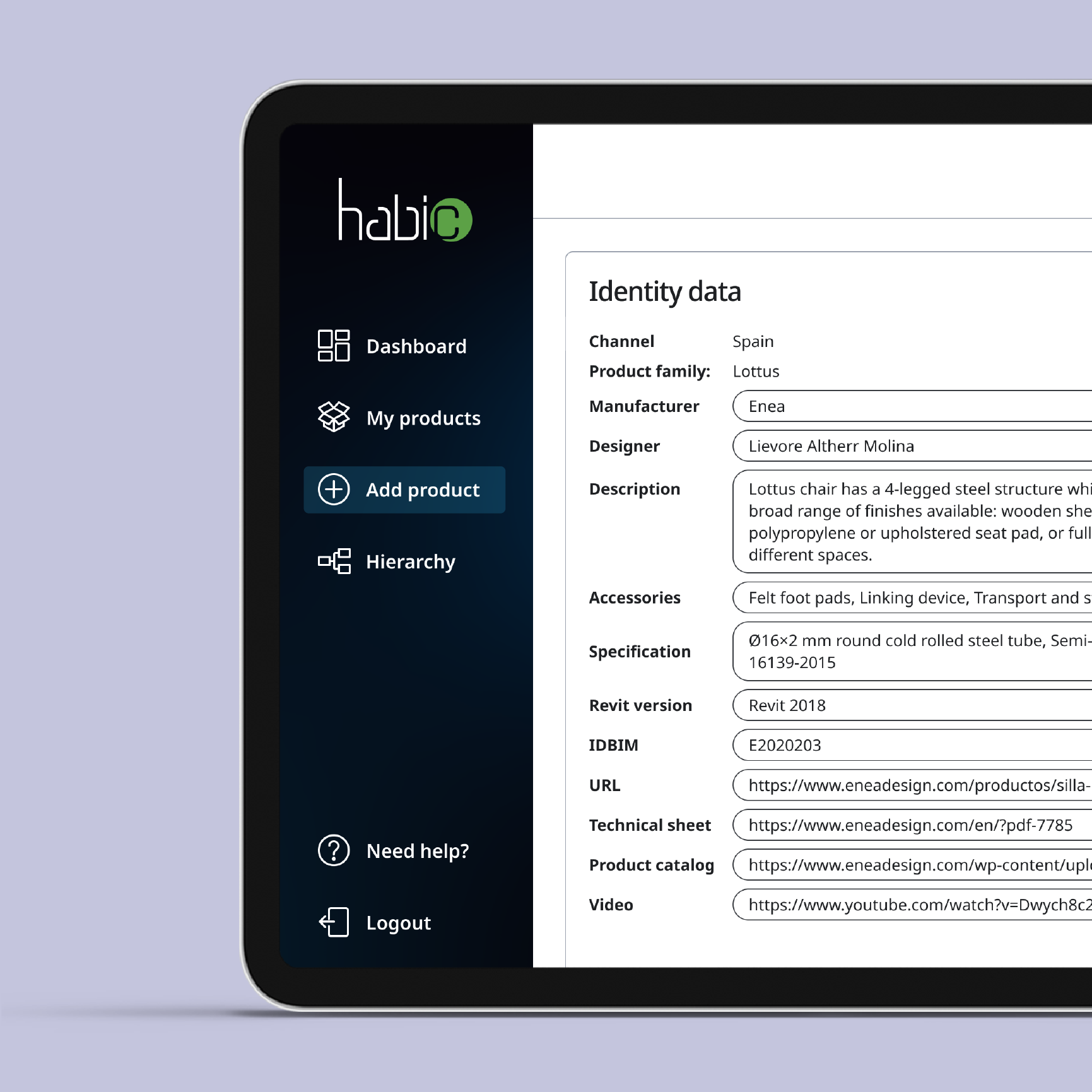
User flow
I concentrated on the most complex and demanding process performed in the Backoffice app: the process of adding a new product to the database. This is mostly because other processes such as: editing the product, adding a new version, adding a variant or managing product hierarchy are in fact sub-processes of this main process.
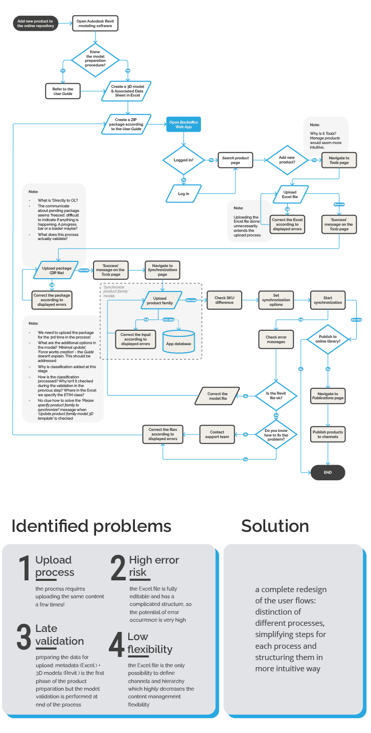
Critical issue
Customer journey
I asked a test user to perform the whole process of uploading a new product to the library. The tester could use the User guide provided by the Backoffice developer as well as approach the support team when needed. The process rendered to be a huge challenge. The tester needed a several dozen of steps to complete it and had to contact support four times due to occurring errors. Due to the process complexity below I showcase a shortened version highlighting key actions.
Usability heuristics
In the audit process I examined usability heuristics:
-
Flexibility and efficiency of use
-
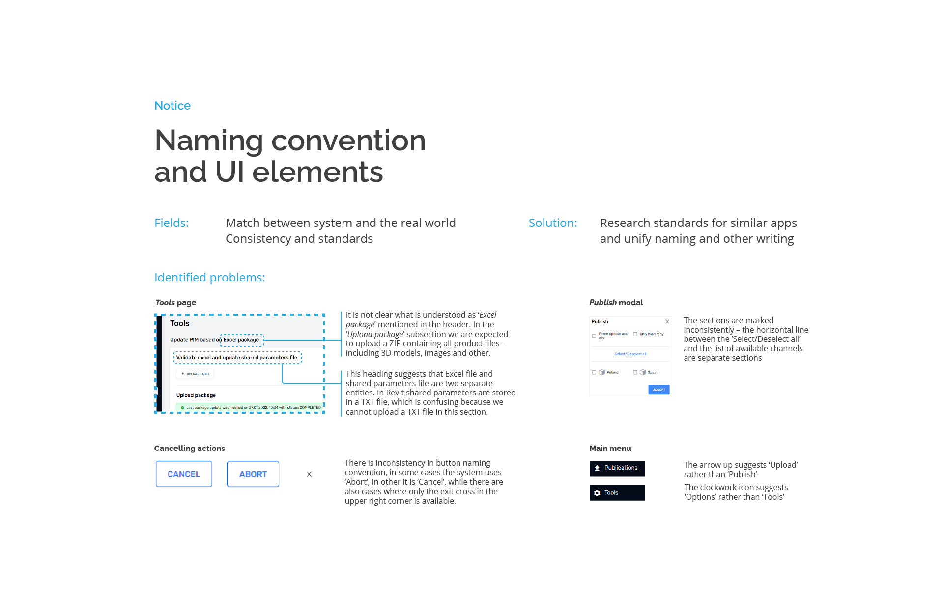
Consistency and standards
-
Recognition rather than recall
-
Visibility of system status
-
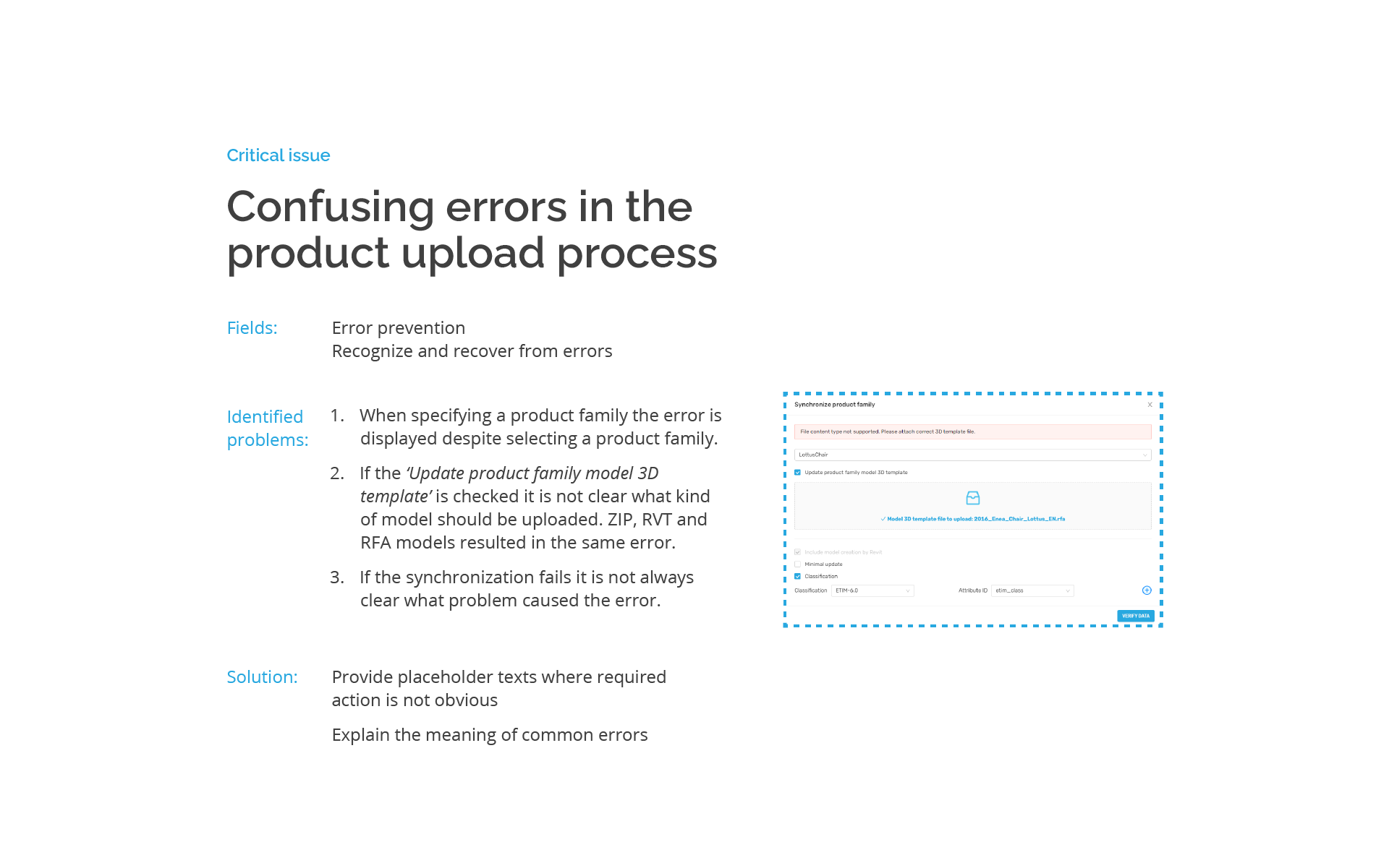
Error prevention and recover
-
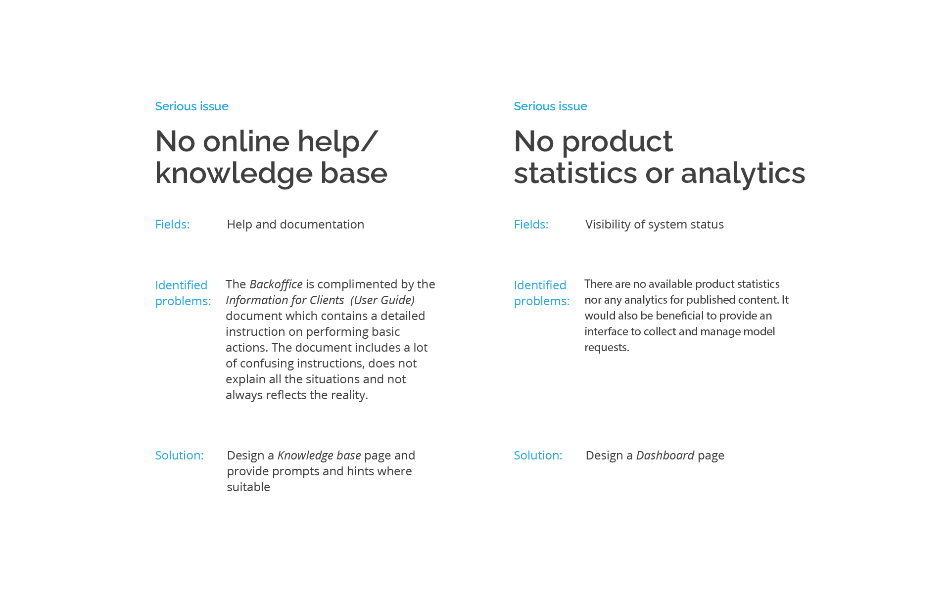
Help and documentation
Below I present the excerpt of the full report.
Design system evaluation
In the thorough analysis I discovered problems in the following areas:
Typography inconsequent usage of text styles, including 6 styles with one-off occurence
Icons inconsistent visual style, multiple styles for the same function (e.g. accordions), limited readability
Buttons & inputs inconsistent styles and labeling
Accordions 7 different accordion styles, overcomplicated nested accordions with mixed aesthetics
Modals inconsistent typography, labeling and design
Audit conclusion
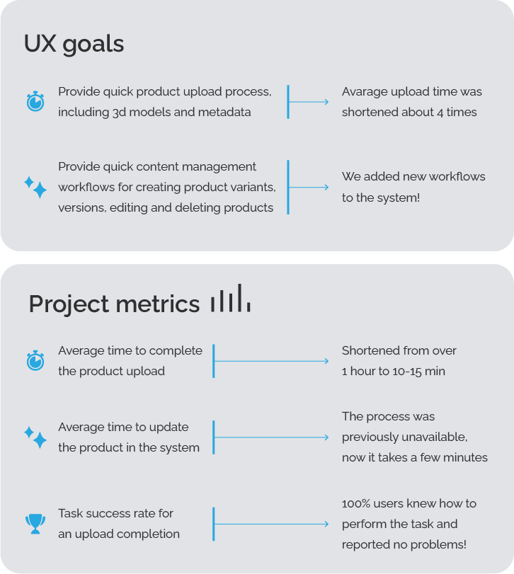
The UX audit revealed a number of issues in different areas that should be addressed to improve the product user experience. Concluding this research I defined 3 main measurable user goals:
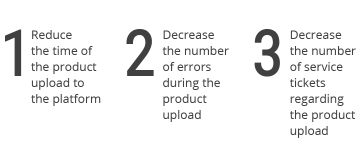
The main findings may be summarized as follows:
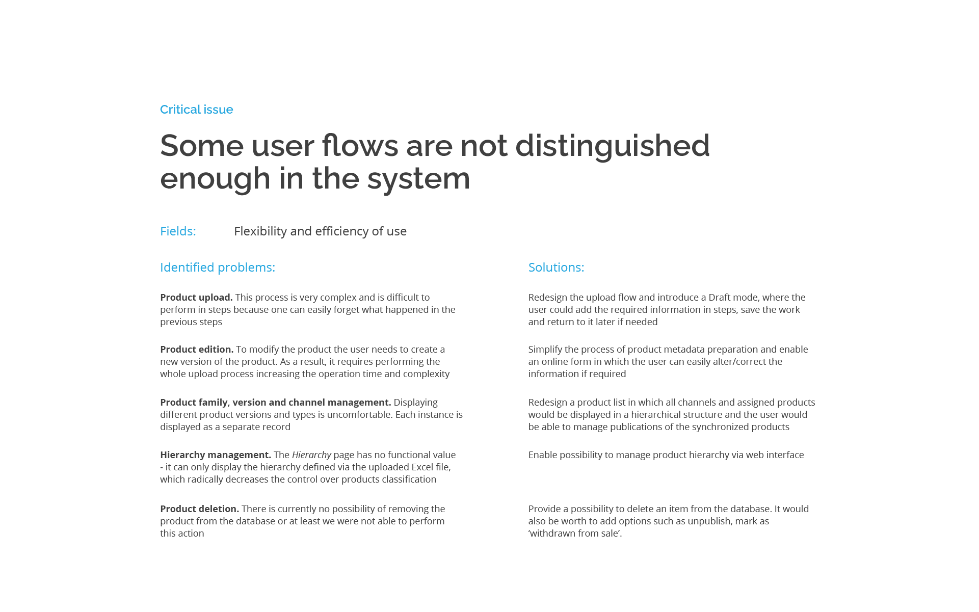
The product upload process is too long and complicated. It has too many steps, involves navigating between multiple pages and has unclear outcomes
The upload process generates unknown errors. Each time it requires contacting support team
The product preparation process is difficult and unclear. The User guide (Instruction for clients) does not always correspond to the Backoffice system and the required steps are difficult to follow
Establishing the product hierarchy is not intuitive and it is not clear how to manage it
The design system is inconsequent, and chaotic, and does not support intuitive product usage
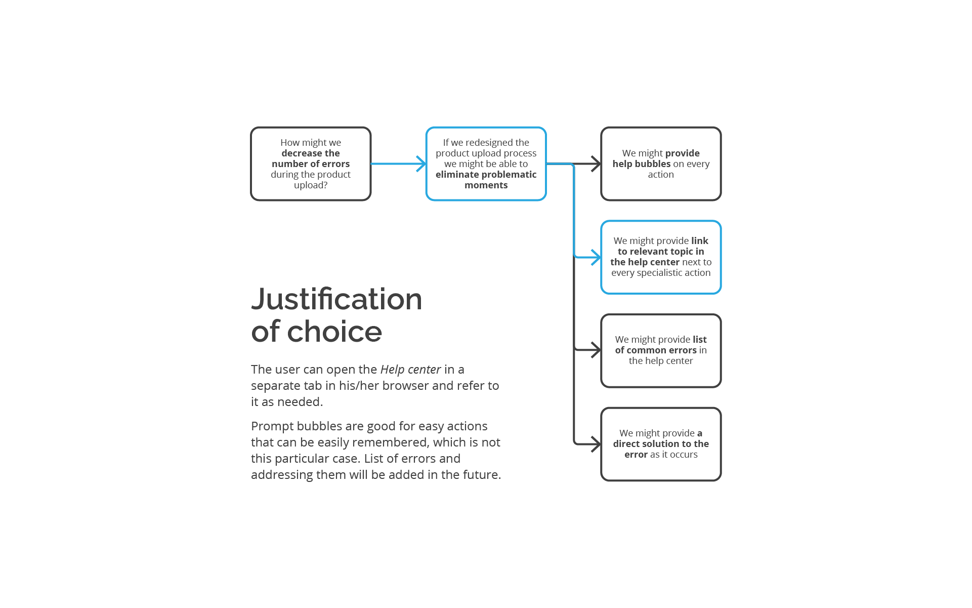
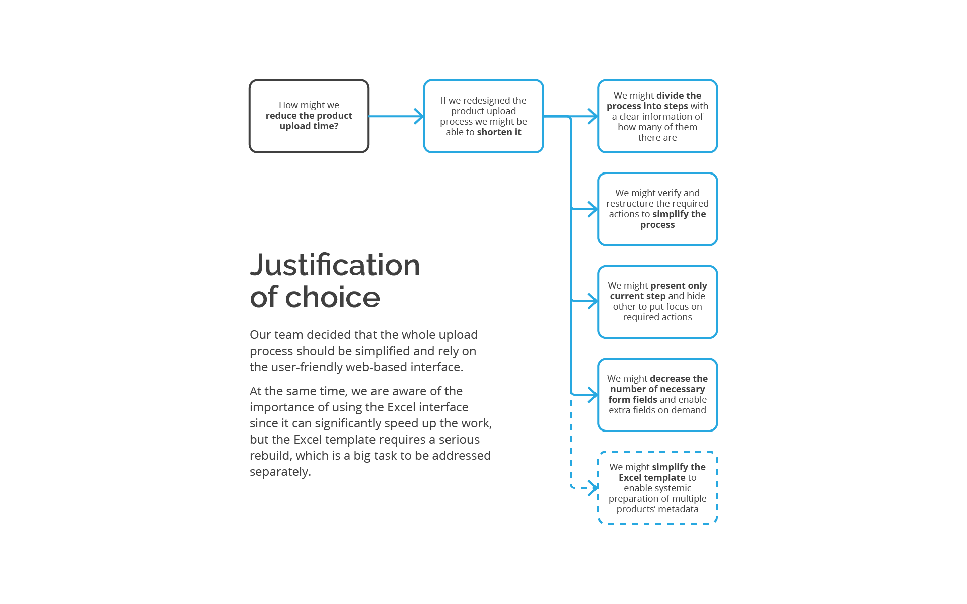
User problems
& solutions
On the basis of gathered user problems I formed hypotheses and possible solutions. The blue highlights indicate ideas that I chose to be implemented into the redesigned Backoffice in the first iteration.
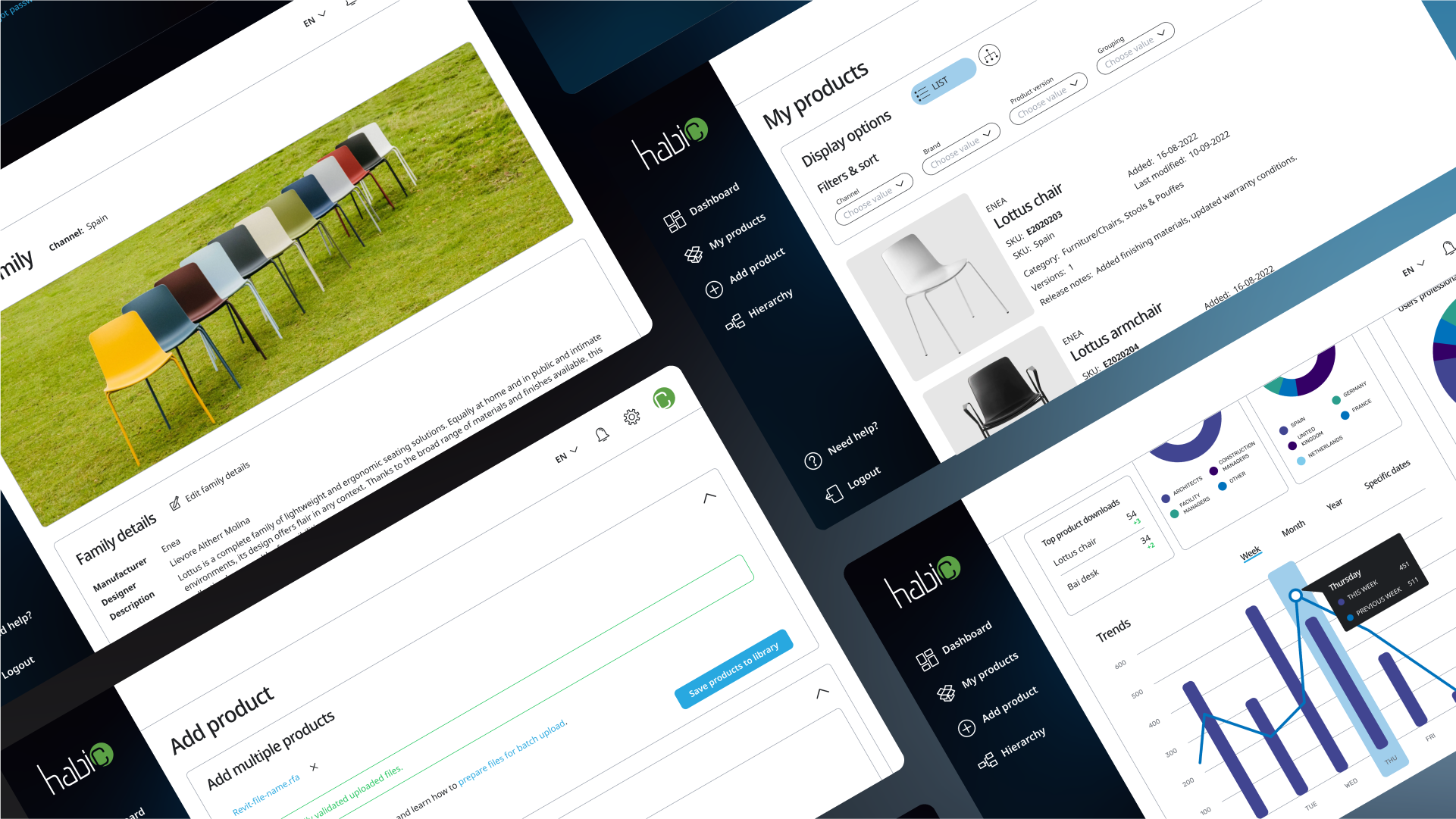
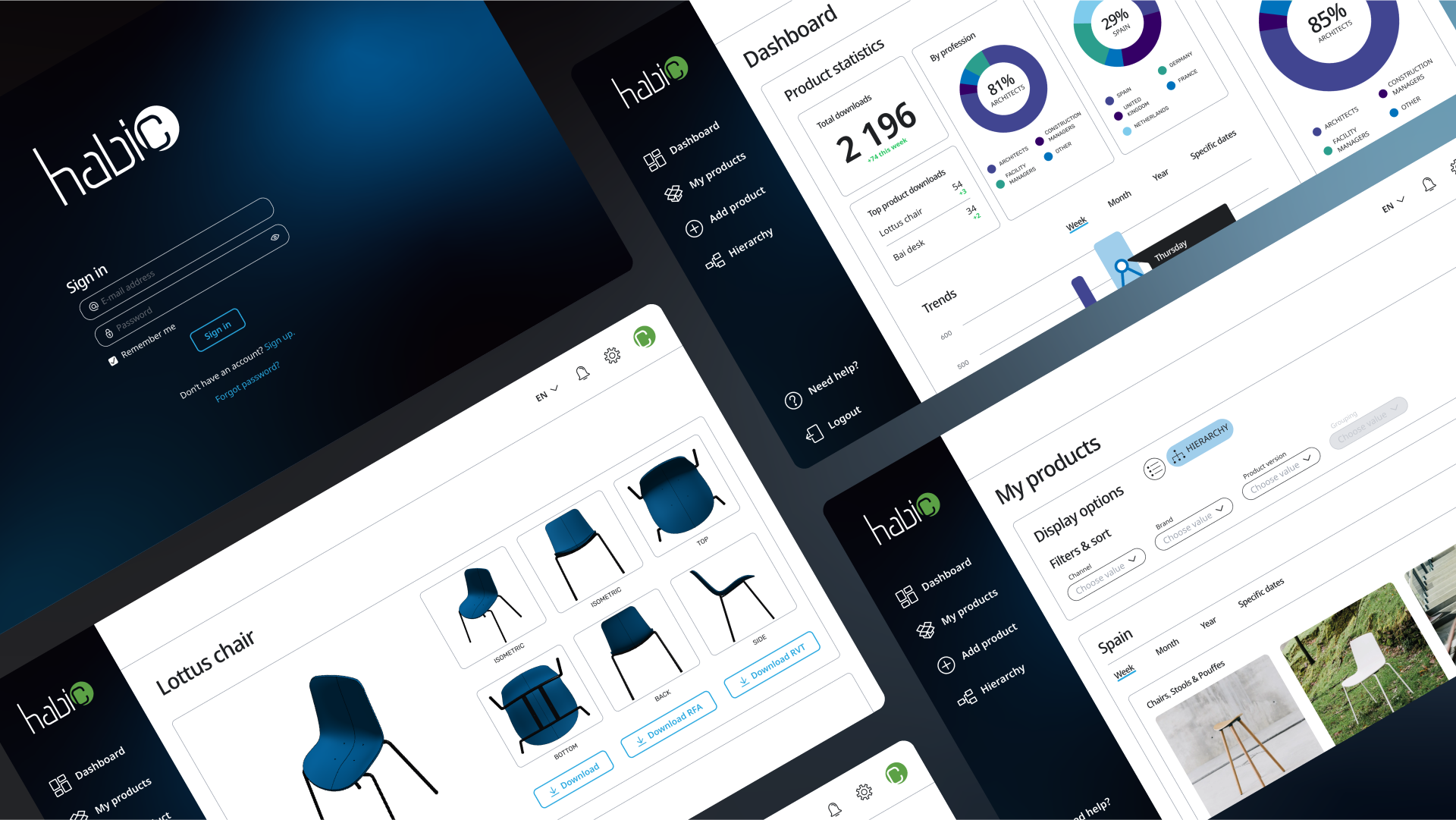
Backoffice redesign
Following the research and detailed UX audit i redesigned the Backoffice web app from scratch. The application is designed for desktop exclusively due to the specificity of manufacturers’ work.
Information architecture
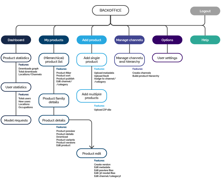
User flows
UI design
Having the application structure established I began to work on the user interface redesign. I’ve spent quite a the time taking notes, sketching screens, UI elements, components and their compositions in different variants.
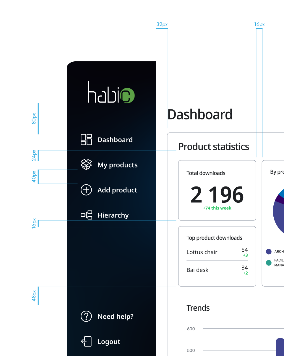
The project layout is based on 8-point grid. For content organization I used several Gestalt principles: Proximity, Similarity, Continuity and Closure.
Redesigned
Backoffice
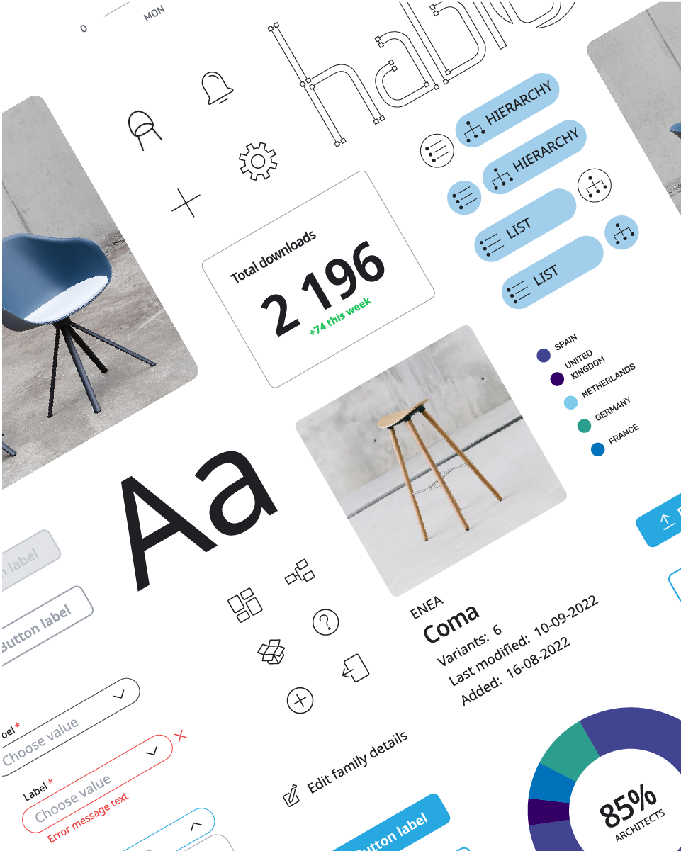
The new Dashboard feature empowers manufacturers to discover which products draw designers’ interest and plan their business strategy.
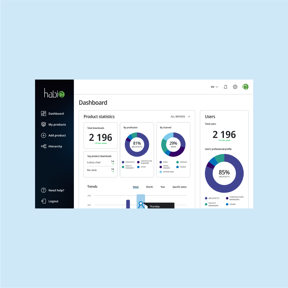
Overview of the
Dashboard page
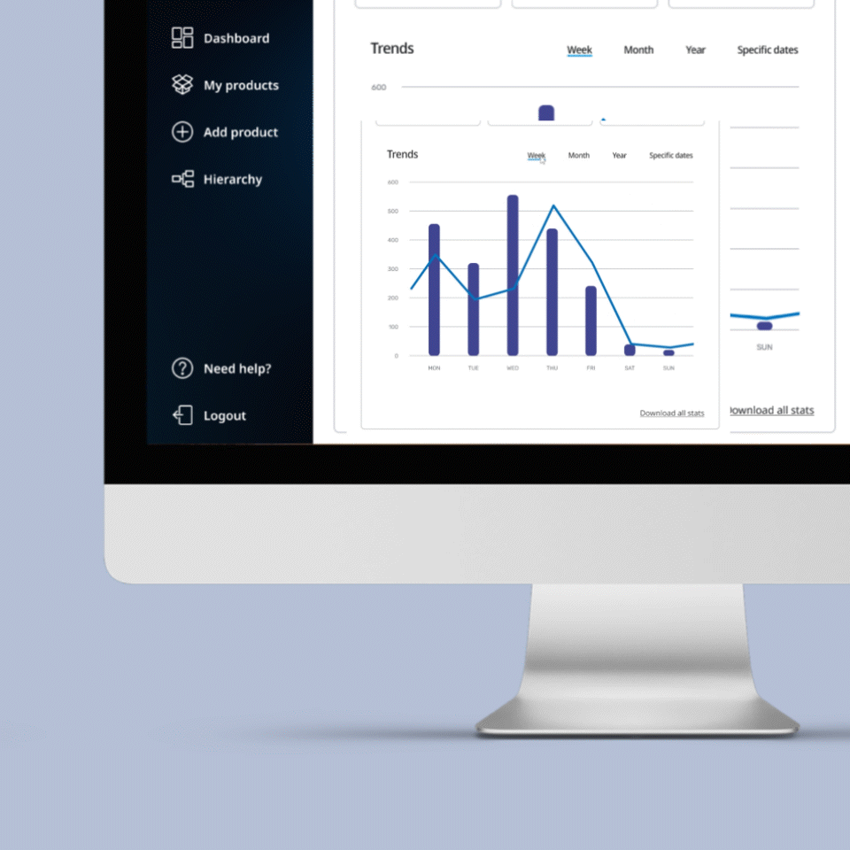
Scaling data to desired
time period
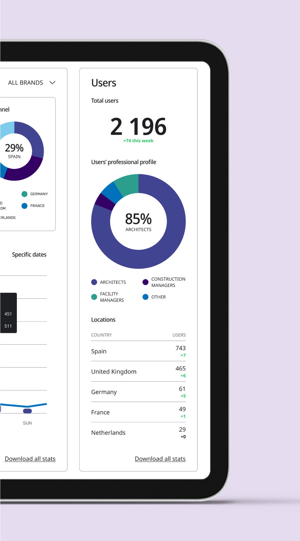
Knowing your users
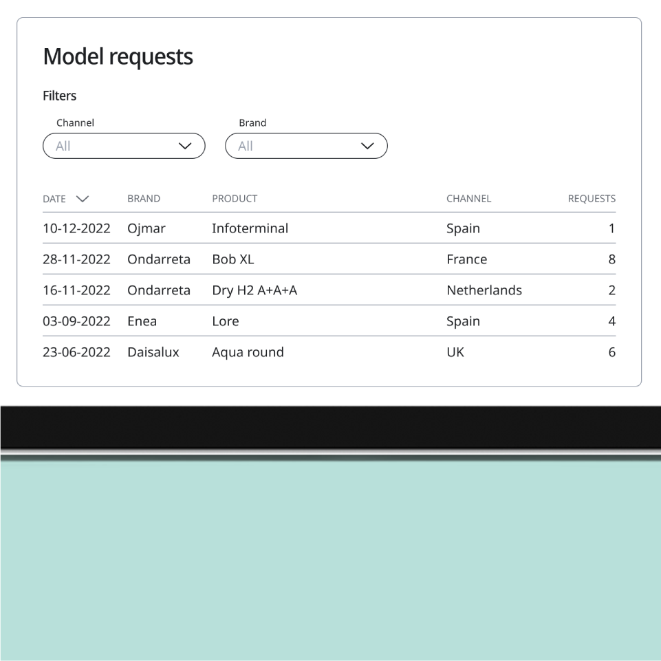
Recognizing most desired
product models
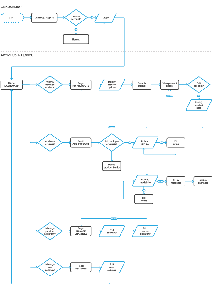
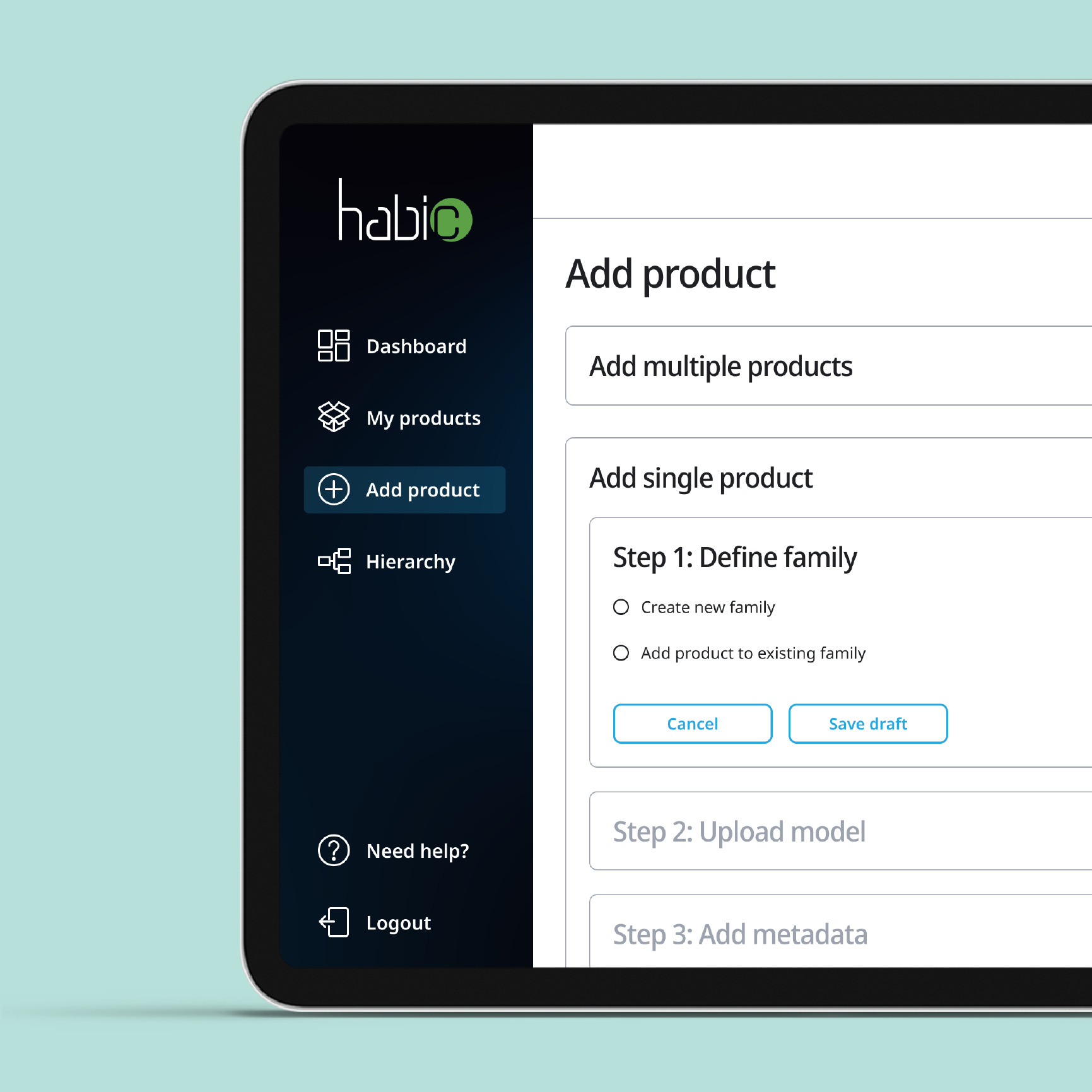
The completely redesigned process of adding products to the library gives the user full control over each step and lets them save their work for later. The upload process branches at several points. To establish this tree of actions I performed a number of iterations involving card sorting and tree testing sessions. To save your time I present only the last iteration, but I’d be happy to discuss the full design process in the interview 🙂 To explore the full flow view the prototype in Figma.
View prototype
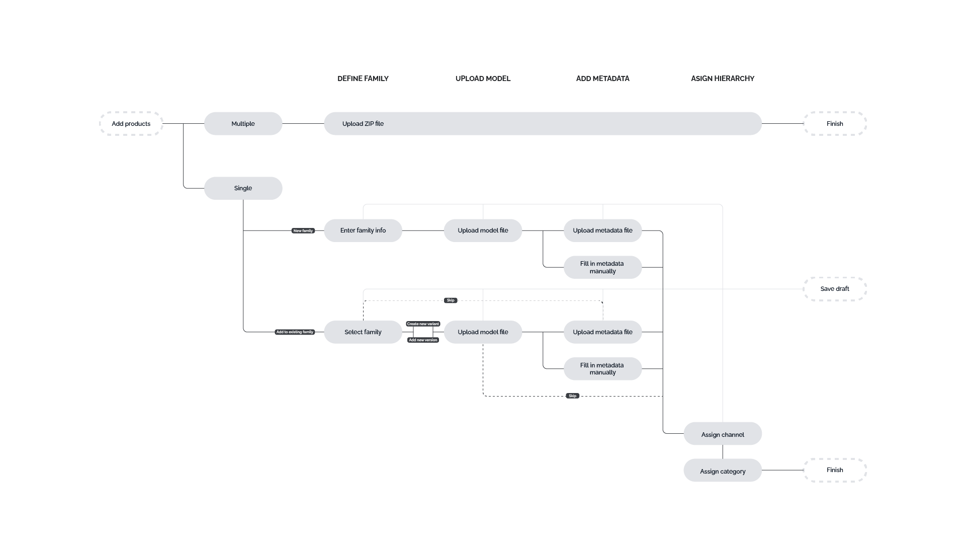
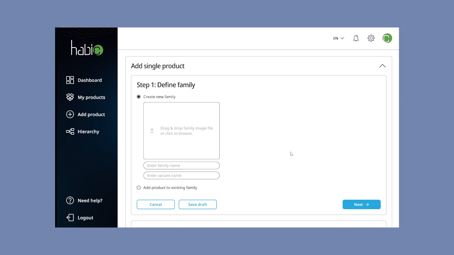
Mistaken? Stay on track
with constand validation
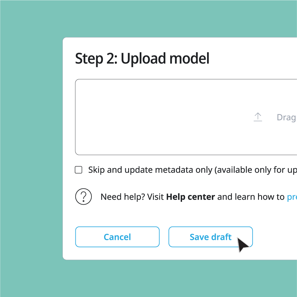
Tired? Save your work
and come back later
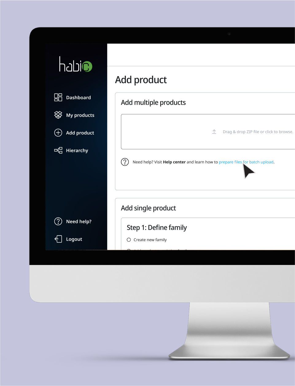
Confused? Check your
workflow with the Help center
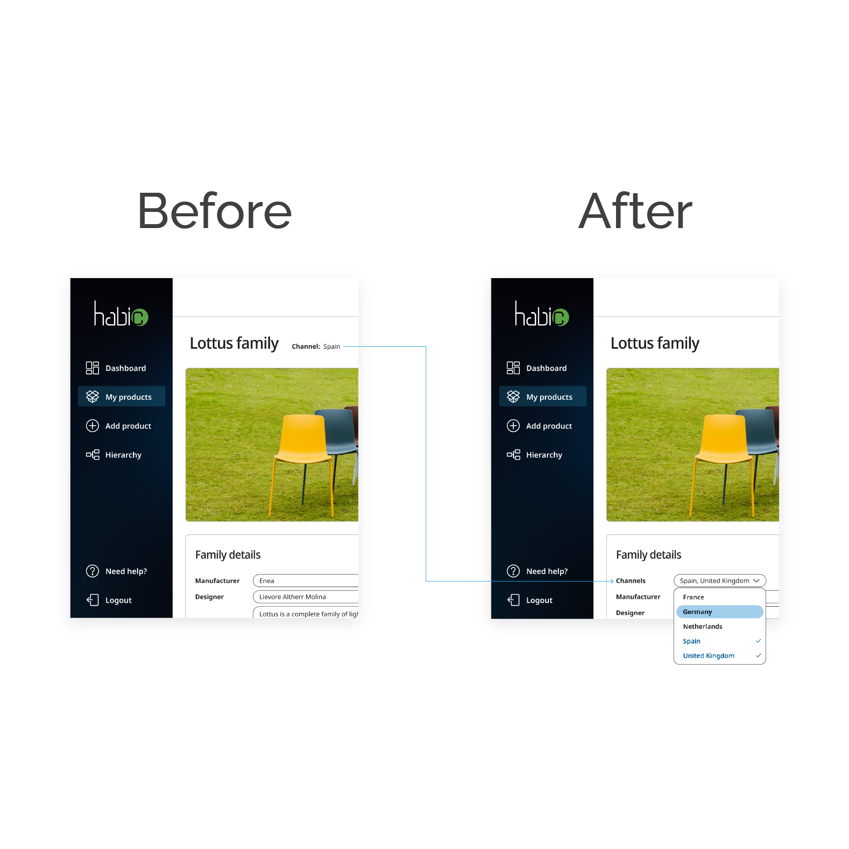
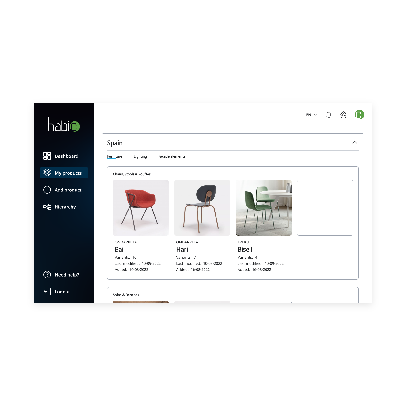
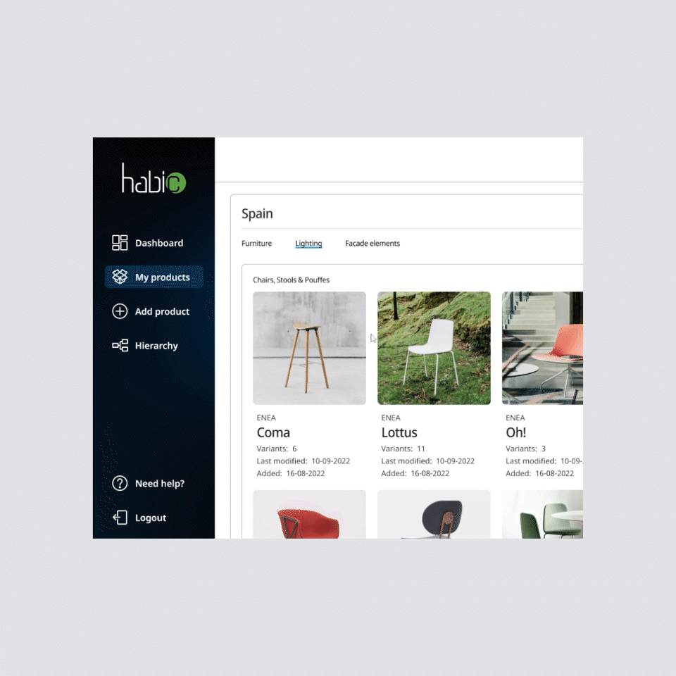
The upgraded My products page enables hierarchical display of products by channel. The products can be filtered by manufacturer and/or version.
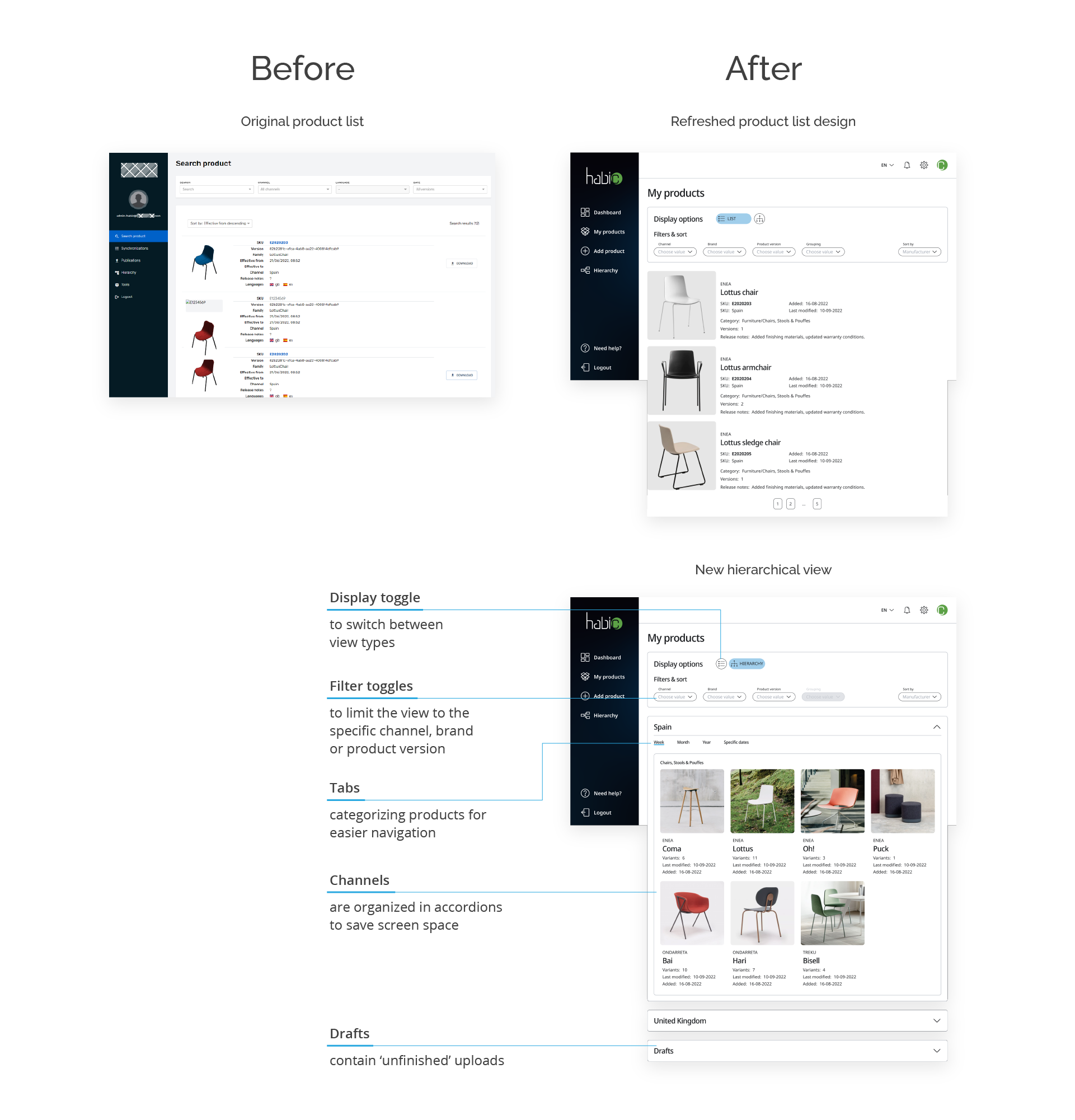
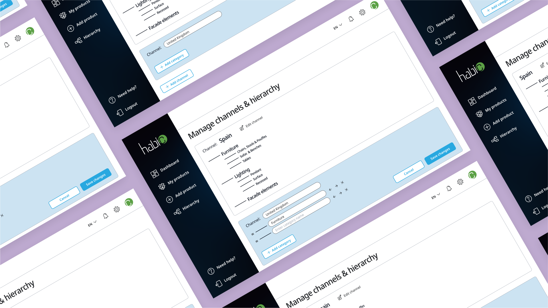
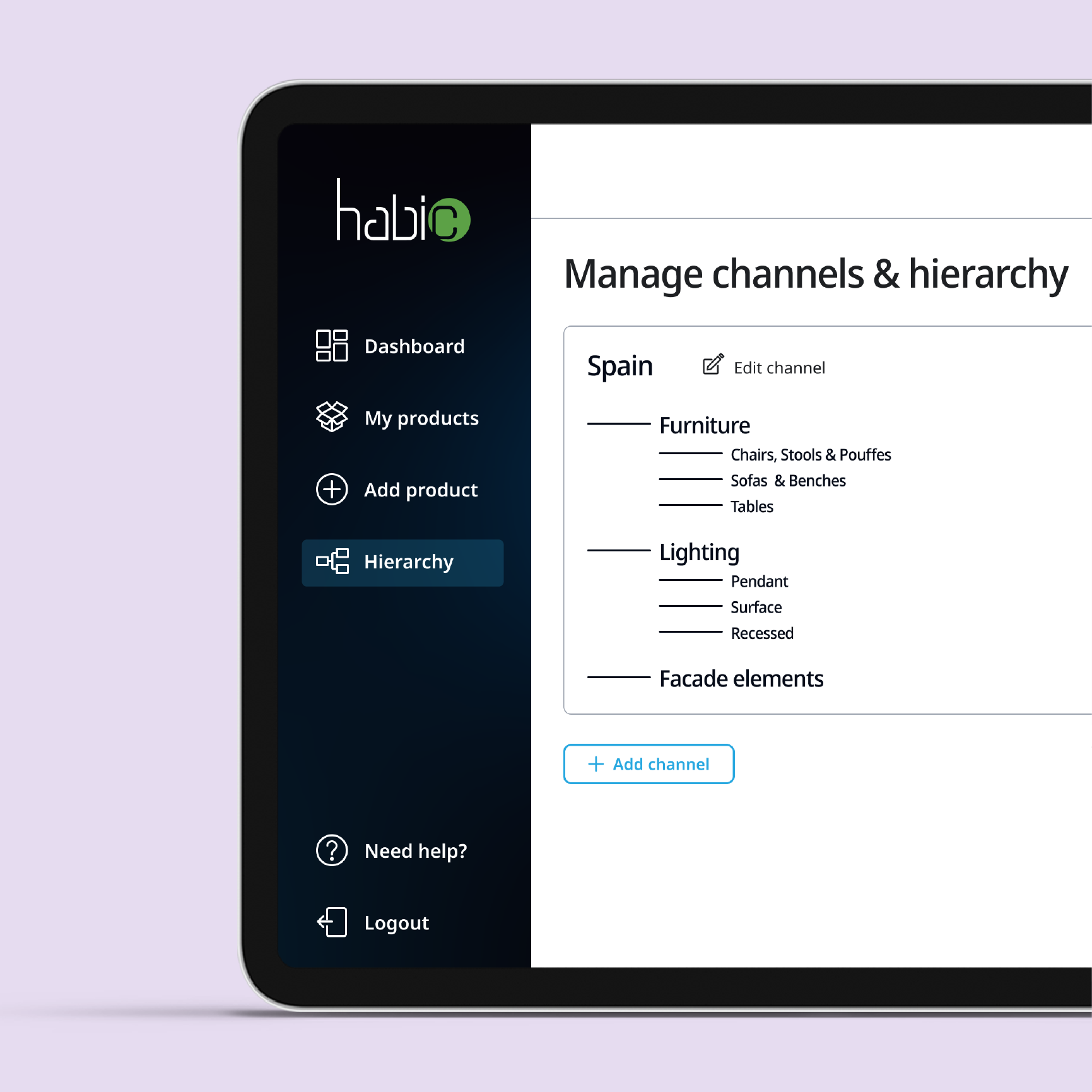
Product hierarchy can now be edited graphically in the dedicated Hierarchy page.
Usability
testing
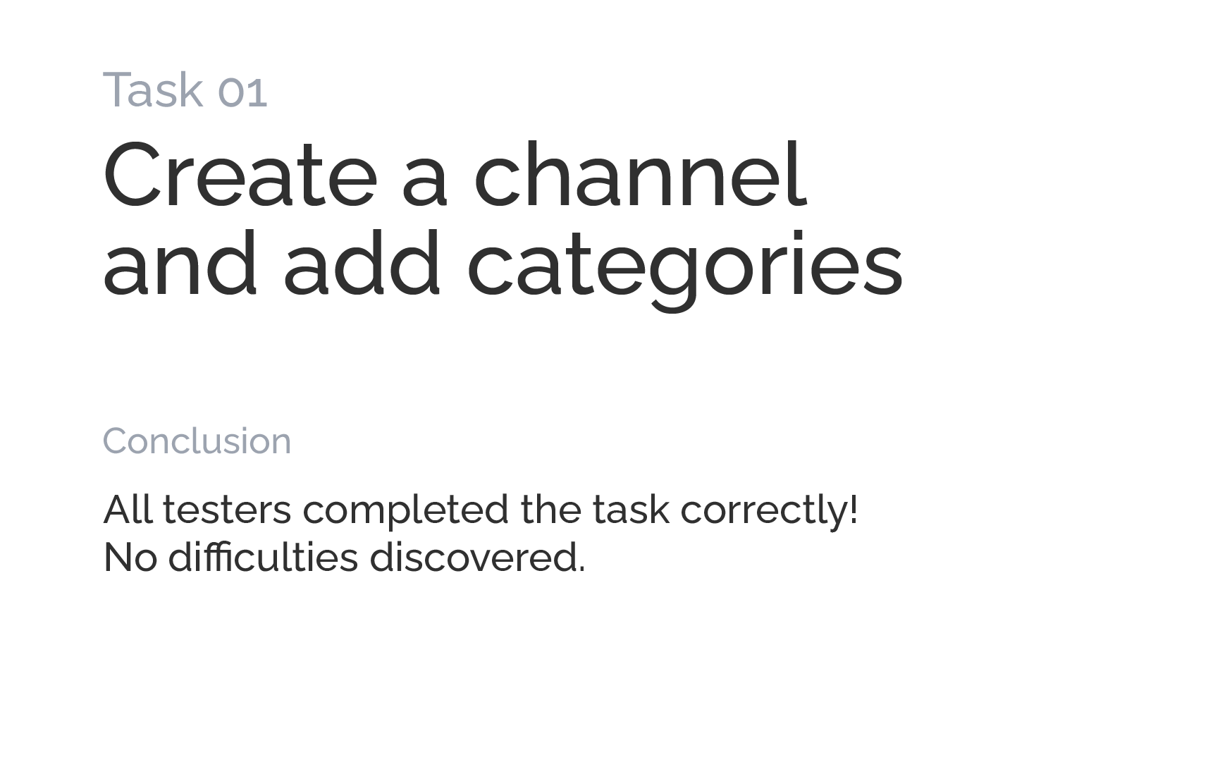
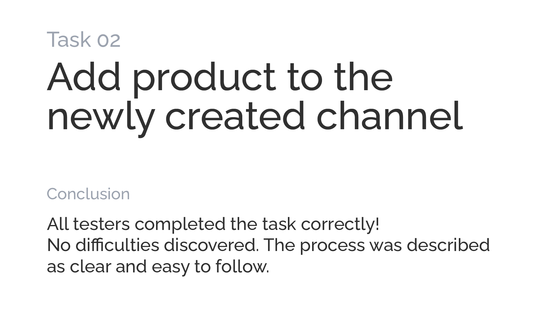
During usability testing we examined if the redesigned application solves the problems identified previously. The users followed a 3-step scenario:
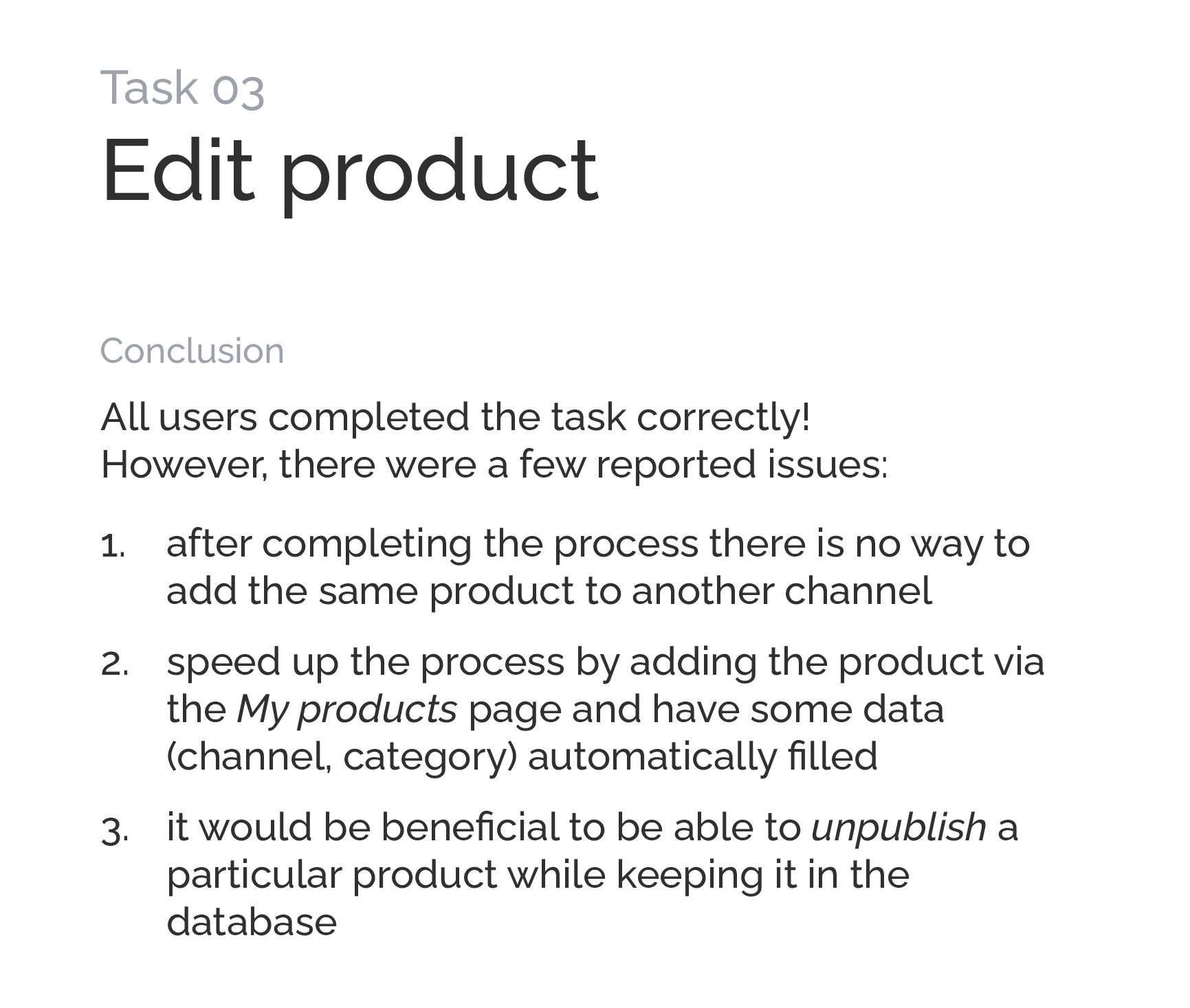
Design
upgrade
We addressed the above issues in the next design iteration. Here is what we proposed:
Revisiting project goals
At the time of preparing this case study the project is still in early deployment. However, we’ve been able to measure some of the goals so far.